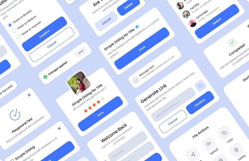


Switching MAUI Themes at Runtime
.png)
When developing modern applications, choosing the right themes is crucial for enhancing user experience and interface aesthetics. The Grial UI Kit for .NET MAUI makes it easy to implement multiple themes, allowing you to:
- Offer various themes as user preferences
- Honor the device system settings for light/dark modes
- Adapt to specific branding requirements, even in complex white-labeling scenarios
In this blog post, we'll guide you through leveraging the Grial UI Kit to seamlessly switch between these themes at runtime, ensuring your application remains fully functional and visually appealing.
Step-by-Step Guide
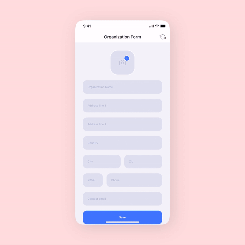
In this guide, we will be using the Light and Dark themes. We’ll create a ToolbarItem to trigger the theme switching. The page selected to showcase the runtime theme change is the OrganizationFormPage. You can download it through Grial Studio or by downloading a new Grial solution from the Web Admin.
Setting Up the Main Page and Default Theme
Set the app’s main page In the App.xaml.cs file, wrapping it with a navigation page as a parent:
MainPage = new NavigationPage(new OrganizationFormPage());
Also, ensure that the LighTheme or the DarkTheme is included in the App.xaml's MergedDictionary:
<ResourceDictionary.MergedDictionaries>
...
<localthemes:LightTheme />
...
</ResourceDictionary.MergedDictionaries>
Adding the Toolbar Item
We need to add the ToolbarItems to the OrganizationFormPage. Instead of using the out-of-the-box MAUI ToolbarItem, we will use the Grial ExtendedToolbarItem that supports dynamic color changes. The code should look like this:
<?xml version="1.0" encoding="UTF-8" ?>
<ContentPage
...
>
<ContentPage.ToolbarItems>
<grial:ExtendedToolbarItem
Glyph="{x:Static local:GrialIconsFont.RefreshCcw}"
FontFamily="{StaticResource IconsFontFamily}"
Size="24"
Color="{DynamicResource OnSurfaceColor}"
Command="{Binding SwitchThemesCommand}" />
</ContentPage.ToolbarItems>
...
</ContentPage>
As you can see, the SwitchThemesCommand is bound to the ExtendedToolbarItem. Next, we’ll be creating the ViewModel with that command to actually swap the themes.
Creating the ViewModel
Here's how the ViewModel should look:
public class ViewModel
{
public ICommand SwitchThemesCommand => new Command(OnSwitchThemes);
private void OnSwitchThemes()
{
var lightTheme = Application.Current.Resources.MergedDictionaries
.FirstOrDefault(md => md is LightTheme);
if (lightTheme != null)
{
Application.Current.Resources.MergedDictionaries.Remove(lightTheme);
Application.Current.Resources.MergedDictionaries.Add(new DarkTheme());
}
else
{
var darkTheme = Application.Current.Resources.MergedDictionaries
.FirstOrDefault(md => md is DarkTheme);
Application.Current.Resources.MergedDictionaries.Remove(darkTheme);
Application.Current.Resources.MergedDictionaries.Add(new LightTheme());
}
}
}
As we mentioned previously, either the LightTheme or the DarkTheme were included the App’s merged dictionaries. With that in mind, the theme switching logic is as follows:
- searches for the
LightThemein the App’sMergedDictionaries - when found, it means that we’ll be switching to Dark, so Light gets removed and Dark added to the collection
- when not found, it means that we’ll be switching to Light, so Dark gets removed and Light added to the collection
Binding the ViewModel
Finally, we need to set an instance of the ViewModel to the BindingContext of our page:
public OrganizationFormPage()
{
InitializeComponent();
BindingContext = new ViewModel();
}
Adding the Toolbar Item
Another powerful feature you can implement is adapting your app's theme to the current phone mode (Light/Dark). MAUI provides a way to detect and respond to system theme changes, ensuring your app remains consistent with the user's device settings.
Detecting System Theme Changes
To detect system theme changes and apply the appropriate theme, you can subscribe to the RequestedThemeChanged event. Here’s how you can do it:
1. Subscribe to Theme Changes
In your App.xaml.cs, subscribe to the RequestedThemeChanged event:
public App()
{
InitializeComponent();
Application.Current.RequestedThemeChanged += OnRequestedThemeChanged;
MainPage = new NavigationPage(new OrganizationFormPage());
}
private void OnRequestedThemeChanged(object sender, AppThemeChangedEventArgs e)
{
ApplyTheme(e.RequestedTheme);
}
2. Apply the Appropriate Theme
Create a method ApplyTheme that will apply the theme based on the current system theme:
private void ApplyTheme(AppTheme theme)
{
if (theme == AppTheme.Dark)
{
var lightTheme = Application.Current.Resources.MergedDictionaries.FirstOrDefault(md => md is LightTheme);
if (lightTheme != null)
{
Application.Current.Resources.MergedDictionaries.Remove(lightTheme);
}
Application.Current.Resources.MergedDictionaries.Add(new DarkTheme());
}
else
{
var darkTheme = Application.Current.Resources.MergedDictionaries.FirstOrDefault(md => md is DarkTheme);
if (darkTheme != null)
{
Application.Current.Resources.MergedDictionaries.Remove(darkTheme);
}
Application.Current.Resources.MergedDictionaries.Add(new LightTheme());
}
}
3. Initial Theme Setup
Ensure the theme is set correctly when the app starts:
public App()
{
InitializeComponent();
Application.Current.RequestedThemeChanged += OnRequestedThemeChanged;
ApplyTheme(Application.Current.RequestedTheme);
MainPage = new NavigationPage(new OrganizationFormPage());
}
Conclusion
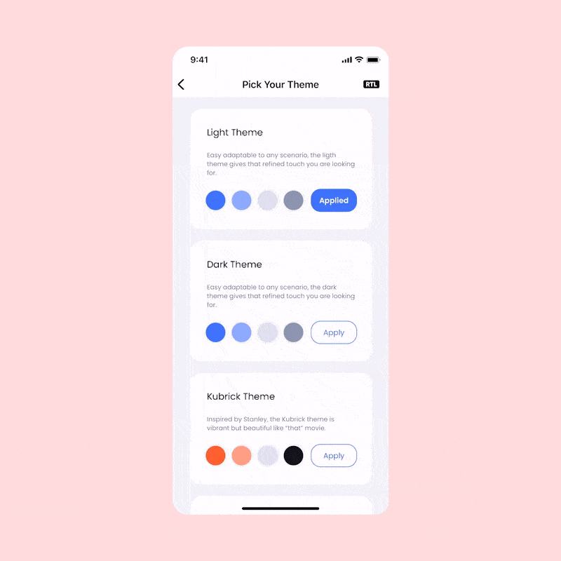
That's it! Now your app users can switch between themes using the toolbar item button, or adapt to the device system settings. It should look like this:
With Grial UI Kit, switching themes in your MAUI app is straightforward and enhances the user experience by adapting to different lighting conditions and user preferences.
We hope you found this guide helpful! If you have any questions or run into any issues, feel free to leave a comment or reach out on social media. We'd love to hear your feedback and see how you're using Grial UI Kit in your projects.
Don't forget to share this post with your fellow developers and spread the word about the amazing capabilities of Grial UI Kit. Happy coding! 🚀