


Mastering Cross-Platform UI Development with NET Maui Controls

Mastering Cross-Platform UI Development with NET Maui Controls
Complete list of .net maui controls
.NET MAUI (Multi-platform App UI) is a cross-platform framework that enables developers to create apps for Android, iOS, macOS, and Windows using a single codebase. It is a successor to Xamarin.Forms and is currently in preview mode. .NET MAUI provides a wide range of controls that developers can use to create modern and responsive apps.
In this article, we will provide a comprehensive list of .NET MAUI controls that are available for developers. These controls will help developers create stunning user interfaces and improve the user experience of their apps.
What controls are availabe in .NET MAUI?
1. Button
2. Label
3. Entry
4. Editor
5. Slider
6. Switch
7. Stepper
8. CheckBox
9. RadioButton
10. Picker
11. DatePicker
12. TimePicker
13. WebView
14. ListView
15. ScrollView
16. TableView
17. TabbedPage
18. CarouselPage
19. MasterDetailPage
20. NavigationPage
21. ToolbarItem
22. SearchBar
23. ProgressBar
24. ActivityIndicator
25. BoxView
26. Image
27. Frame
28. Grid
29. AbsoluteLayout
30. RelativeLayout
31. StackLayout
32. FlexLayout
33. ContentView
34. TemplatedView
35. VisualElement
36. Page
37. Shell
38. FlyoutPage
39. CollectionView
40. RefreshView.
How do I use XAML-based controls in .NET MAUI?
To use XAML-based controls in .NET MAUI, developers can define the UI elements in XAML markup language. This allows developers to create UIs visually, just like in Xamarin.Forms. The XAML files are then compiled into platform-specific code, which makes it easy to develop cross-platform apps with a single codebase.
Developers can also use C# code to create the UI elements instead of XAML. This approach is useful for developers who prefer to work with code instead of markup language. Both approaches are supported in .NET MAUI, which gives developers the flexibility to choose the best approach that suits their preferences and workload.
In conclusion, .NET MAUI provides a wide range of controls that developers can use to create modern and responsive apps for multiple platforms. With XAML-based controls and the ability to use C# code, developers can choose the approach that works best for them. As .NET MAUI is still in preview mode, more controls may be added in the future, which will further expand the capabilities of this powerful cross-platform framework.
.NET MAUI Views and Layouts
This are .NET MAUI views and layouts that can be used to build the graphical user interface of your app. Each of these controls has its unique features and properties that can be customized to match the design and functionality requirements of your app.
For instance, the ListView control is used to display a list of items while the ScrollView control enables users to scroll through a large amount of content. The TabbedPage control allows developers to create a tabbed interface for their app, while the CarouselPage control enables users to swipe through pages of content.
Apart from these controls, .NET MAUI also provides a set of layouts that can be used to arrange the controls on the screen. These include Grid, AbsoluteLayout, RelativeLayout, StackLayout, and FlexLayout. The Grid layout enables developers to create a grid-like layout for their controls while the AbsoluteLayout allows for the precise positioning of controls on the screen. The RelativeLayout enables developers to position controls relative to other controls on the screen. The StackLayout stacks controls on top of each other either horizontally or vertically, depending on the orientation specified. Finally, the FlexLayout provides a flexible layout that can be used to create complex user interfaces.
.NET MAUI tab view
One of the controls provided by .NET MAUI is the TabbedPage control, which allows developers to create a tabbed interface for their app. Tabs are an intuitive way of organizing content and can improve the usability and user experience of your app. With the TabbedPage control, you can create multiple tabs, each containing a different page or view. Users can switch between tabs by tapping on them, making it easy to navigate through different sections of the app.
To create a tabbed interface using the TabbedPage control, you need to define the pages or views that will be displayed in each tab. You can do this by adding Page objects to the Children collection of the TabbedPage control. Each Page object represents a different page or view in your app and can contain any of the controls and layouts provided by .NET MAUI. You can customize the appearance of each tab by setting the Title and Icon properties of the corresponding Page object.
In addition to the TabbedPage control, .NET MAUI also provides a CarouselPage control that enables users to swipe through pages of content. This can be useful for displaying content that is related but not necessarily organized in a hierarchy or a sequence. The CarouselPage control works in a similar way to the TabbedPage control but allows users to navigate through pages by swiping left or right instead of tapping on tabs. This can be a more natural and intuitive way of navigating through content, especially on touch-enabled devices.
Scheduler what is it?
The Scheduler control is another powerful tool provided by .NET MAUI for building cross-platform user interfaces. As the name suggests, the Scheduler control enables developers to create scheduling applications that allow users to manage their time and appointments. With the Scheduler control, you can display appointments and events in a variety of customizable views, including day, week, and month views. You can also add new appointments, edit existing ones, and customize the appearance of the Scheduler control to match the style of your app.
To use the Scheduler control, you need to define the appointments that will be displayed in the control. You can do this by creating instances of the Appointment class and adding them to the Appointments collection of the Scheduler control. Each appointment can have a title, description, start date, end date, and other properties that define its details. You can also customize the appearance of each appointment by setting the color, font, and other properties of the corresponding Appointment object. With the Scheduler control, you can create sophisticated scheduling applications that help users manage their time and stay organized.
Grial UI Kit Datagrid for .NET MAUI
Grial UI Kit datagrid for .net maui Another useful tool for developers using .NET MAUI is the Grial UI Kit DataGrid. This control allows you to display data in a table format that can be sorted, filtered, and searched. The DataGrid control is highly customizable and can be used to display data from a variety of sources, including databases, JSON files, and REST APIs.
To use the Grial UI Kit DataGrid, you first need to define the data that will be displayed in the table. This can be done using a variety of data sources, including observable collections, data tables, and data sets. Once you have defined your data, you can then bind it to the DataGrid control using the ItemsSource property. This will populate the table with your data and allow users to interact with it.
Grial UI kit also includes advance chart controls like pie, bar and line charts, which can be used to visualize data in a clear and easy-to-understand manner. These charts can be customized to match the overall theme and style of your app, and can be bound to a variety of data sources, including local collections and REST APIs. Additionally, the charts are interactive and can be configured to respond to user input, such as tapping or zooming.
Read more about Grial UI kit Charts.
Another useful feature of the Grial UI Kit is its collection of pre-built templates and themes, which can be used to quickly prototype and build apps. These templates cover a wide range of use cases and industries, including e-commerce, social media, and healthcare. By using these templates, developers can save time and effort while still creating apps that look professional and polished.
In conclusion, the Grial UI Kit and other controls provided by .NET MAUI are powerful tools that can help developers create high-quality, cross-platform apps with ease. Whether you are new to .NET MAUI or an experienced developer, these tools and templates can help streamline your development process and enhance the user experience of your apps.
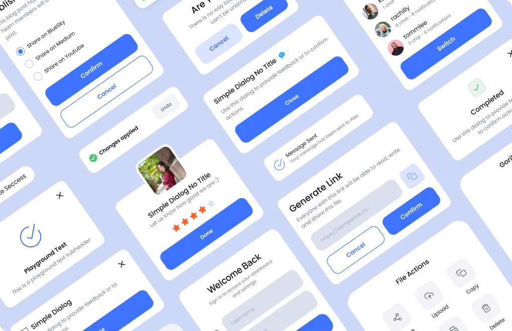
Grial UI Kit - UI Components
The Grial UI Kit offers a wide range of UI components that can be used to build apps for a variety of industries and use cases. These components include buttons, forms, input fields, and toggle switches, among others. Each component is designed with a modern and clean aesthetic that can be customized to match the look and feel of your app.
One of the standout features of the Grial UI Kit is its support for both light and dark themes. This means that developers can create apps that look great in any lighting condition, and users can switch between themes to suit their preferences. Additionally, the Grial UI Kit is built using the latest design trends and practices, ensuring that your app will look and feel up-to-date and modern.
Get started with Grial UI Kit today.