


Grial UI Kit - Swipeable Layout (May 2024 Update)

Continuing from our last release, we're thrilled to dive into one of the most requested features for the Grial 4 Demo App: the stack-based infinite carousel. We're excited to announce that this highly anticipated control is now available as part of the Grial UI Kit!
Initially dubbed the "StackedCarousel" due to its similarity to a Carousel control, we realized that the name didn't quite fit.

After much deliberation, we finally settled on the perfect name! And name is... drumroll, please: SwipeableLayout! It’s a layout where the main feature is swiping through items. Simple, straightforward, it just works! 😊
Read on to discover more about this fantastic new addition!
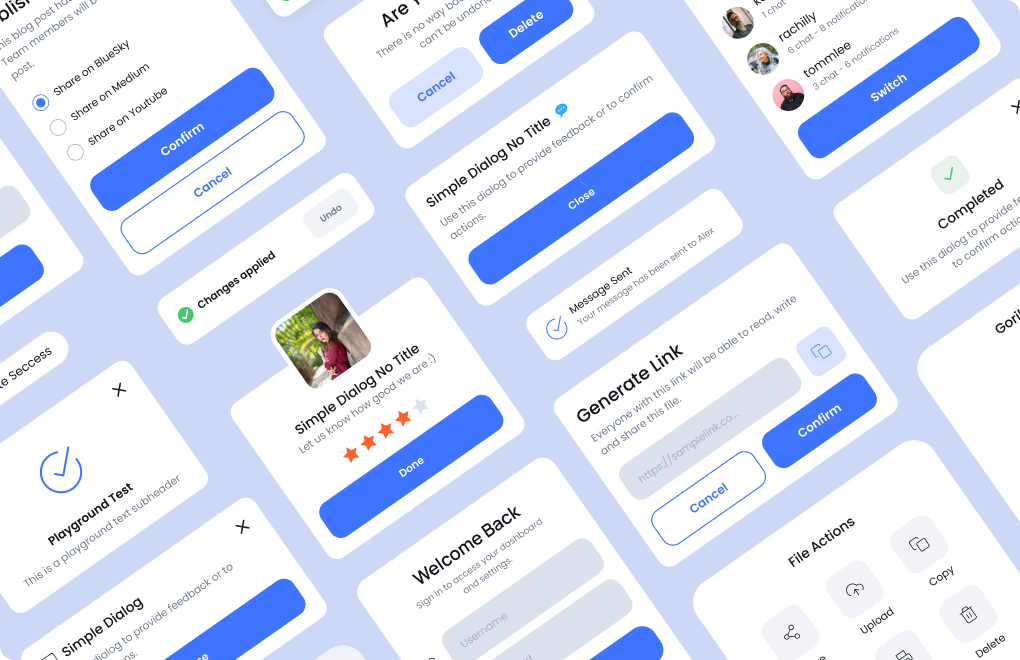
Swipeable Layout Control
The SwipeableLayout exemplifies the flexibility that defines all our controls. Whether you want to showcase a few items in an engaging loop with smooth animations or implement a simple binary choice interface (like yes/no, true/false), the SwipeableLayout has got you covered.

Here are a few highlights:
- Rich Interactions - the star feature is its intuitive and smooth swiping interaction. It offers two predefined options, where items move slightly up or down as they are swiped off the screen, creating a polished user experience
- MVVM ready - easily integrate with the MVVM pattern using ItemsSource and ItemTemplate properties. The control provides various commands and properties to pass its state to your ViewModels, making it simple to control from C# code
- Commands for everything - supports a wide range of commands to keep your ViewModels in sync. Use MoveEndedCommand and PositionChangedCommand to notify ViewModels of changes, and MoveNextCommand and MovePrevCommand to programmatically control the carousel from the ViewModel
- Optimized for performance - it’s 100% virtualized by default, ensuring optimal performance. You can opt out of virtualization if needed
- Flexible API - options to loop items, set position, set item selected, enable or disable dragging, and more
- Empty View Template - provide a unique view when there are no items or if the user has swiped away all items and looping is disabled
- Progressive Animations integration - exposes ScrollProgress property enabling seamless integration with Grial’s Progressive Animations
- Indicator view support - can be linked to an IndicatorView in the same way as Grial’s Carousel or MAUI’s CarouselView
Let's dive into an amazing example our team crafted using this control: The Quiz Flow. Additionally, we created a stunning variation of the Quiz Flow, as a showcase for last week's Microsoft Build event.
You can read more on the docs.
Quiz Flow
We're excited to introduce the Quiz Flow, the 9th Flow in our product lineup! This one is special—it's our first into the game space. The Quiz Flow is a fast-paced, engaging game that makes answering questions fun with our SwipeableLayout. Plus, it showcases charts for statistics and our new Grial ProgressBar, which is 100% customizable and supports fancy visualizations (more on this control below).

Let’s see the pages inside the flow:
- The main dashboard - multiple categories with direct access on top (tap to scroll to the selected category), the overall player level, access to the achievements and a floating menu with extra options for your users!
- Game page - the SwipeableLayout is the star here! users can swipe left for False answers and right for True answers, with beautiful animated indicators for each action
- Game results page - a simple page displaying the results of the quiz
- Achievements page - a complex page with several indicators and charts as a showcase of the game historical statistics
In the image below, you'll see a comparison between a real-world application on the left, which lets you select articles from your articles queue (sampled from great Alfread), the Grial's version in the middle, and a simple iteration achieved using Grial’s DarkTheme with a font change.

Progress Bar Control
We needed a progress bar that supports real styling and looks great on every platform—so we built one! Today, we're excited to introduce the Grial ProgressBar.

Size, corners, colors, texts, everything is customizable. You can even define 2 colors the the label inside so it’s always readable (keeping good contrast with the active/inactive backgrounds) enhancing the UX with no-effort.
It also supports optional animations when the progress changes out-of-the-box, and integrates with Grial’s Progressive Animations thanks to the AnimatedProgress and AnimatedRelativeProgress properties that reflect the progress as it changes during animations.
You can read more on the docs.
Smart Home - Air Conditioning Settings ❄️
Last year, we shipped the Smart Home flow, demonstrating how to bootstrap an app to control smart home devices in a house or office. Besides navigation and the overall shell, it included a specific device configuration for a Smart Lamp. We've heard our users asking for more, so today, we're excited to present the new Air Conditioning configuration page!

Just like the Smart Lamp configuration, the Air Conditioning page follows the same structure to ensure consistency. Thanks to the scalable layout we originally built, this page not only allows you to change the device's current state but also enables scheduling configurations for future use. But there's more! As you can see in the image above, there’s a beautiful circular slider to control the temperature. That’s our new CircularSlider control. Let's dive into that!
Circular Slider Control
At UXDivers, we've had the opportunity to create several fancy non-linear sliders and gauges for various cool projects. Our demanding clients often asked for something beyond what out-of-the-box solutions could offer. Drawing from this experience, we decided to provide Grial users with a Circular Slider to simplify this type of visualization.
Why not just use a regular slider, you might ask? In scenarios where high user engagement is required, especially in HMI (Human-Machine Interface) UIs, resemblance to physical devices is essential. Volume knobs, for instance, are often circular to mimic real-world interactions.

CircularSlider features:
- Range control - Min / Max values config depending on your domain
- Center label - size, font, format, etc; everything to display an optional label that changes along with the value
- Drawing - Start/End angles can be set; a full circle can be used too!
- Styling - Active, Inactive and Background colors as separated values; line cap if you want rounded or other style
- Thumb customization - the thumb is a template so you it can be anything, the control is responsible for placing it properly so you just need to define how it looks
- Commands - ValueChanged, DragStarted and DragCompleted commands and events to have full control.
You can read more on the docs.
Setting Pages
We're excited to unveil a new category in Grial: Settings Pages! While settings pages might not be the most complex part of an app, they are crucial and must be done right. Grial has always featured a nice and simple Custom Settings Page, but we felt it was time to expand our offerings. It's worth noting that back in the Xamarin.Forms days, we had another one based on the TableView (yes, we go way back! 🧓).
Now, we're introducing five new settings pages to this category. Let’s take a look:

We hope you'll find one that closely matches your needs. Of course, tweaking these pages to fit your unique requirements is easy, thanks to the clean and well-structured XAML code.
Dashboard with SwipeableLayout Page
But wait, there’s more! 😄
With the introduction of the SwipeableLayout, we've decided to include a page that resembles the main dashboard of our Demo App. This page is called: DashboardSwipeableHeaderPage (yes, once again, naming things can be tough 😓).

We hope you find this one useful too!
More goodies
We updated the default Grial Slider Style to look like the one in the Preferences page:

And the previous style is now called TallSliderStyle and looks like this:

Bug fixes
And last but not least! Here’s a list of fixes included in this release:
- Fixed slider shadows glitch on android
- Fixed overlay color on smart home flow popups
- Fixed visual issues on Dashboard Carousel Page
- Improved slider touch interactions
- Fixed issue on navigation bar related with modal navigation on Android
- Improved rating touch interactions
Hope you like the new content! Stay tuned for more 🙂
Let us know if you have any feedback, and follow us here. See you next month with a new update!